Stone Mountain: No Stone Unturned
Athens, GA
2023
A fresh re-imagining of Stone Mountain park.


In response to a theoretical proposal for an updated brand for the Stone Mountain State Park, our team of three designers researched into the park to see what the current situation was. After a series of desk research, surveying, and even a group outing to the park itself, our team found that the park was not offering a cohesive experience to its visitors. We also found that the park still bares some negative feelings from people regarding its history as well as its massive confederate mural carved into the mountain’s side. This project seeks to create a new brand image for the Stone Mountain national park that promotes inclusivity and creates a more cohesive experience for all park-goers.
RESEARCH
My team started the project looking at Stone Mountain’s current branding and exploring the public perception of the park. We dove into its confederate history and studied the construction of the mural.
After that we sent out surveys asking participants what their experience with the park was, including whether they had been there or not and what words came to mind when they thought of the park. These are some of the most common words that came up:
FAMILY
HIKE
NATURE
OUTDOORSY
RACIST
HISTORICAL
CAMPING
LASER SHOW
With an idea in mind and a healthy helping of desk research on the parks history, our team then planned an outing to the mountain to see it for ourselves.


While we had a great time hiking and getting some fresh air, the point of our visit wasn't to explore the outdoors as much as it was to explore branding. From trail signs to merchandise, we combed the park to get a feel for the brand experience that the park offered. Unfortunately, we weren't exactly impressed.
Signs all around the park were very inconsistent, with some utilizing bright colors and a modern design and others attempting a more natural look to blend in with the environment. This seems like a symptom of an addition of new signage later in the parks years, with the natural signs looking older and more worn. This creates an inconsistency with its branding, where half the time Stone Mountain is attempting to be a national park and the other half they're attempting to be an amusement park.


Even in the gift shop, we found countless different looks for Stone Mountain. Every shirt and mug seemed to have a different typeface for Stone Mountain and colors looked as if they were picked at random.


While we didn't get to personally see them on this trip, we also took note of the laser show and dinosaur attractions at the park. With the inconsistent brand image, the random mash-up of attractions, and the spotty history of the place, our group were finally able to come to an agreement on a starting point for the parks image. We wanted to focus on the natural beauty of the mountain and the forest surrounding it while also providing a more in-depth learning experience in the guest center.
While we didn't get to personally see them on this trip, we also took note of the laser show and dinosaur attractions at the park. With the inconsistent brand image, the random mash-up of attractions, and the spotty history of the place, our group were finally able to come to an agreement on a starting point for the parks image. We wanted to focus on the natural beauty of the mountain and the forest surrounding it while also providing a more in-depth learning experience in the guest center.
With a focus on the mountain's natural beauty, then what better place to put that guest center inside of the mountain itself?

While this project was proposed as a simple rebrand of the park, our group was given an infinite budget for this project. This meant that we had the chance to take the project from a rebrand to a re-imagining of what Stone Mountain could be.
While this takes the project to fantastical measures, we were very into the idea of turning the mountain into a massive center, and for good reason. Since we wanted to keep the focus of the park on nature, putting the center within the mountain would allow us to "hide" all of the amenities while keeping visitors close to the physical "heart" of the park. This wasn't just some funny idea we came up with, it would actually become the key and focal point of our branding process.


After much sketching and name exploration, we came to the new and improved, "Stone Mountain: No Stone Unturned." Along with the focus on nature, we wanted to make sure that no aspect of the park was being left unexplored, thus the name. The logo was designed around the natural focus of the park, with a tree standing against a sunset over the park's lake. The tree cutting through the "sunset" also alludes to the hidden guest center that cuts through the center of the mountain. These elements all together create a logo that encompasses everything new about the park.
This logo would be a semester long process, constantly going back and tweaking it over and over again until we settled on the perfect version of itself.
We had to go through many different phases of exploration, from type choice and treatment...


...to color exploration...
....and even painstakingly adjusting every measure of the logo's shapes until the felt just right.


As we settled on the different elements of the logo, we simultaneously picked those pieces back apart to create our branding guidelines. The colors and typeface we came upon were chosen to feel right at home within nature while feeling modern enough to represent a push towards a new future for the park.
With a logo and branding system in place, our team also wanted to represent what the actual center could look like. It is a very fantastical concept, so it would make sense that we provide a glimpse into our vision. This presented itself as an opportunity to explore an emerging technology to aid our exploration in the form of AI.


AI EXPLORATION
We would use Midjourney AI as our tool of choice. Through a great deal of trial and error, we created all sorts of depictions of the park that we would then manipulate in order to create the vision of the Stone Mountain experience. This would include...
...rooms of the education center...


...what the integrated parking would look like...
...and what the entrance to the mountain (the central elevator) might look like.

This was a fun experiment for the project and it allowed us to produce interesting results. While AI proves to be a difficult topic in the art world, I’m glad that I took the time to explore what it can do for us. I think I will probably not use it in the future for my projects however, as I wasn’t personally happy with all of the depictions we created. Some of the results come off strange and otherworldly in ways I don’t think were intentional among my team members.

FINAL RESULTS
As we neared the deadline of our project, it was time to put all of our work and ideas together. Utilizing our branding, AI exploration, and graphic design skills, we created mock-ups for all kinds of aspects of Stone Mountain park.


Signage utilizing the inevitably leftover stone from hollowing out the mountain would make great land markers and trail signs.
Banners using the park's branding would excite and guide park-goers at the entrance of the park as well as inside the moutain center.


That signage would of course need graphics, particularly icons, to help park-goers find their way throughout their stay.
These icons would of course be a huge help in designing other material for the park as well, including things such as tickets and the park pamphlets.


Guests would surely find these helpful in the complimentary park map.
Guests would surely find these helpful in the complimentary park map.
While this would of course be provided to any attendees, guests can also access the map in the mobile app which is also designed to help guests curate activities while they visit.


Of course, the park would need some new advertisement, in the form of both social media...
...and signs to advertise out across the state.


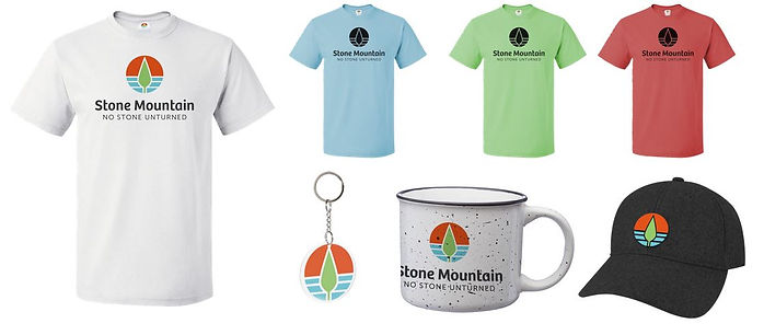
Finally, we of course needed to mock-up some of our own merchandise.
With everything said and done, we had accomplished what our group had set out to do. We had successfully re-imagined Stone Mountain park, creating a whole new branding and way-finding system that would be sure to wow anyone visiting the park. This was a fun project for our team and while this was only a theoretical rebrand, I think we created a park experience anyone would remember.


